by Dan Perrera
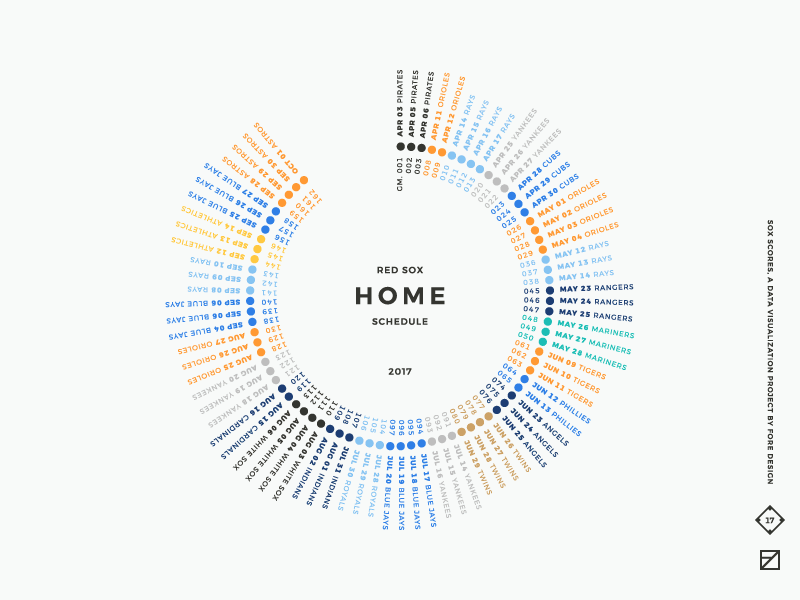
The Boston Red Sox season came to a close in the middle of October, as did the second year of our popular Red Sox Scores project. The undertaking explores the intersection of two of our favorite, but seemingly disparate, things: design and baseball.
The 2016 project was bound by just two constraints: each score had to be posted before the start of the next game, and the final score had to be visually represented in the design. While this led to some interesting work and some themes did emerge over the course of the season, the body of work felt disjointed.
While being creatively unbound was an excellent place to start from, we wondered what would happen if we added more constraints for our second season so, this year, in addition to the time and content parameters from 2016, home games had to be on a white background, away games on black, and the Red Sox always had to be red. We also created a complementary palette of colors for opposing teams, making sure no two sets of colors would ever end up back-to-back.
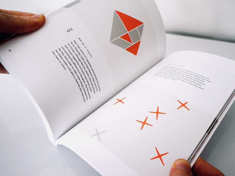
I’m particularly proud of how we evolved the project this year. The result is a stronger, more interesting, and more cohesive body of work. Like last year, we collected the complete season in a 6x9-inch, softcover, perfect-bound book, indexed by date, game number, and opponent, with a special score cheat sheet. In addition to the book, we’re offering 18” x 24” posters of select visualizations. If you enjoyed the project, purchasing one of our products is the best way to support it.
We’re so pleased that we’ve found something that we can share with the world every day during baseball season. The reaction and support we’ve received from the design community, friends, and family has kept us motivated to keep the project going. Red Sox Scores will be back for 2018 with even more interesting updates.